Over on the Lee & Low blog this week and next, the designer of Vodnik—Isaac Stewart*—and I are discussing the design process of the book. What you see over there is very similar to the process I have with most designers. The designer reads the book and provides some concepts based on the things I’ve said I’d like to see, and what I tell him or her takes into account the author’s suggestions as well.
What I didn’t get into over there is what I do before that process begins, to think about what *I* want. Sometimes I have a very clear idea of what I’d like to see on a cover, or the author has such good suggestions that I just tell the designer, “Let’s try something like that!” And when the designer comes back with concepts (which we’re going to cover next week), often what they come up with is so much better than I could have thought up on my own that it sparks ideas that meld into something entirely new (again, see what we’ll be talking about next week for more on that part of the process).
But when I don’t have a clear idea of what I want, I tend to do something similar to what I hear writers do as they brainstorm: stare into space and appear as if I’m not working. I also take trips to the bookstore and collect covers I find intriguing for one reason or another in a Pinterest board (which isn’t very big yet, as I’ve just started doing this). The books on the board may or may not end up being used as inspiration when I talk to a designer eventually, but just thinking about type, images, and what stands out to me on a shelf and how these covers interact with each other helps me to think about what I’d like to see when we apply those ideas to the particular book I’m working on.
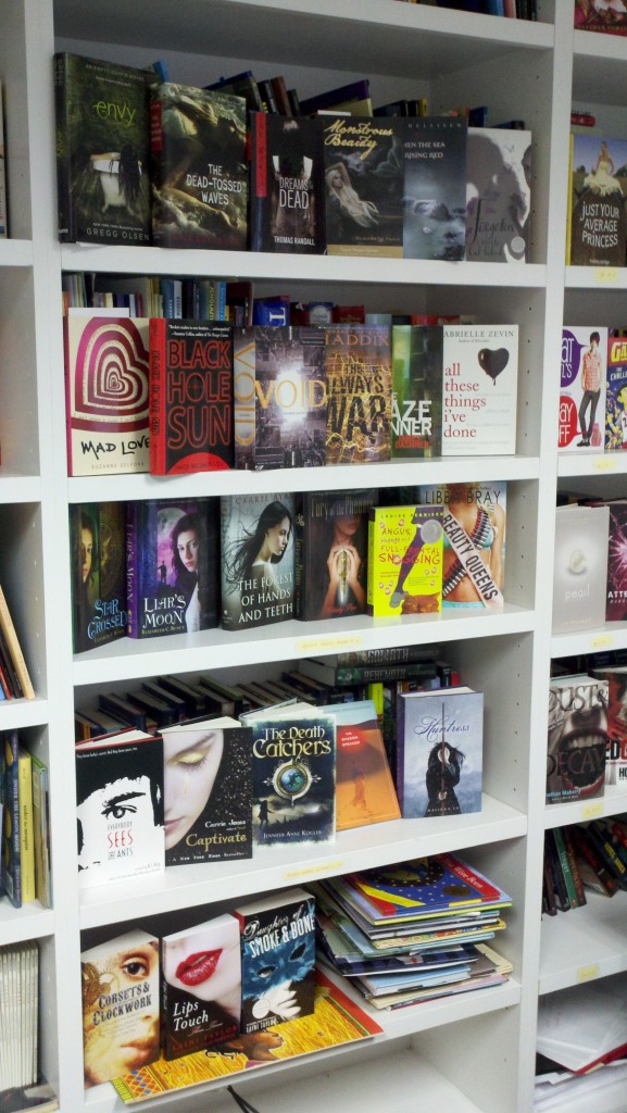
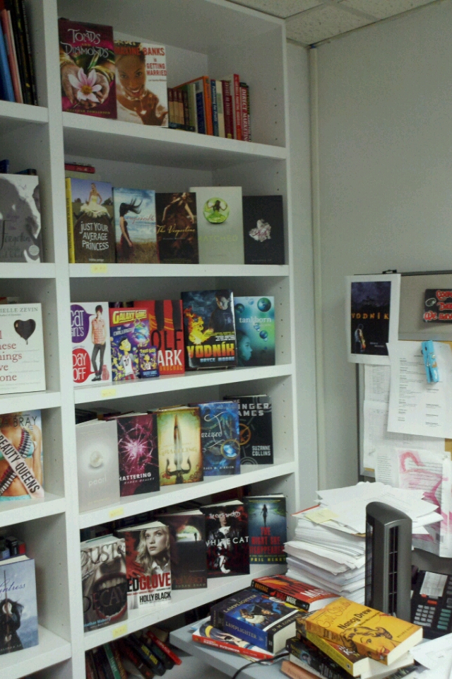
Then I come back to the office and I start rifling through my own bookshelves.
I pull out a bunch of books whose covers are interesting (some interesting in better ways than others, but this is all part of my process, thinking about what’s popular, what stands out, what is overdone, what I still love after several years, etc.). Then I sit and stare at them some more.
And eventually I come up with a few covers that I think will help the designer if I say, “Here are some key concepts I’m looking for, and here are some covers that I think stand out.” Then the designer will usually come back with something that takes those thoughts into consideration yet still completely blows me away. And that’s the most interesting part of the process, so stay tuned for next week’s post on the Lee & Low blog.
*Fun fact: Isaac is also Aprilynne Pike’s brother-in-law.


Comments are closed