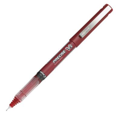
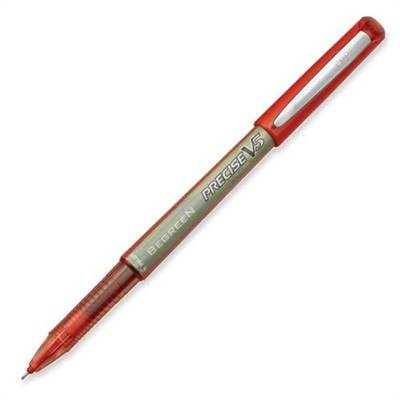
Quick review of the redesigned Pilot Precise V5 Extra Fine

In a sentence: WHAT DID YOU DO TO MY PEN??
I loved the old Precise V5s. Almost every editor I know who I’ve ever talked pens with loves the Precise V5. It’s got a fine enough tip to write between lines of text without smearing ink everywhere, and it was steady and sure.
And when I went back to the supply shelves today to find a new red pen, I certainly found a new pen, all right. Why in the world would anyone reinvent a pen that already works perfectly (besides, of course, a tiny little exploding problem)?
Looking at the new pen in comparison to an old one here on my desk, the construction feels cheaper. It doesn’t have the heft to it that the previous version did, which I felt was balanced perfectly. It’s more flimsy plastic, and it writes like one of those cheap ball-point pens that I avoid—you know, with a little wiggle feel to it, which kind of negates the whole point of the PRECISE pen.

The new tip now scratches across the paper rather than gliding as the old pen used to. The ink and precision of what you write itself looks okay, but the process of writing isn’t as comfortable as it used to be. The length and width physically seem to be similar, except that the nib of the new pen is shorter than the old one and I feel like I have to choke up (back?) on this pen to hold it in the same position as the old pen, yet that means holding more of the fat part of the pen, rather than the part that fits my hand. There seems to be more plastic, but maybe that’s just a vibe I’m getting because the way the ink flows down into the nib is a straight tube rather than those weird layers of plastic (which would eventually explode in the most inconvenient way possible).
IF (and only IF) the changes mean fewer explode-o-pens in my purse/pocket/backpack/hand, I could probably get used to everything except the annoying scratch of the nib across the paper. The very tip of the nib where the ink comes out doesn’t appear to the naked eye to be any different in design than the previous pen, so I’m unsure why it moves differently across the page.
I’ll probably get used to it, if it means continuing to be able to have neat(er than my usual) handwriting when I edit. But I am a bit sad to see the old design go. Why mess with it?
ETA: Hm, now I’m confused. I went to the Pilot site, and now it seems that the V5s are V5/V7s? Can anyone tell me what’s up with that?
Hmmm… Have you tried the clicky version yet? They don’t make them in my usual purple/pink/bright blue pack, but I’ve been using them for the black pens & they’re awesome *and* refillable. I think they have them in red, but maybe not… I’ll have to check out this new version; I hate it when they mess with things that work & those are my fave pens, too!
I haven’t. I’ll have to check them out—maybe they have more of a heft to them. I’m just not all that impressed with the redesign. Why fix what isn’t broken?
Nooooooooooo, they changed them?? I love these pens too and have one of the old ones in my pocket right now. They are just about my favorite sketching pens ever. I haven’t had to buy news ones for awhile (thank you Sam’s club jumbo pack) so I havent seen the down grade in person. This makes me sad. Hopefully they might bring em back if we occupy pilot pens…just kidding, they are getting a letter from me though.
This happens all the time. Companies take perfectly good products and “improve” them. They did that to my body lotion, tissue, deodorant. Seriously! If it works, leave it. if you want to change the formula, make a whole new different product and leave the original ALONE! Didn’t anyone learn from Coca-Cola’s disaster? Sigh.
Exactly! Especially as loyal as an editor is to a good pen. Though of course I suppose there aren’t enough editors to support a whole brand of one pen. 🙁
So that’s what happened to my proofreading pens! Son of a gun! Now I’m mad.
I’m using a Uniball Vision Elite right now. It makes a dark enough line for the graphic artists to catch when they have to do corrections, and I can write fairly legibly (though I’m a proofreader cursed with bad handwriting), though a finer tip would work better for legibility.
Now I’m going to run downstairs and ransack the supply cabinet for any old Precisions lurking in the corners….
Oh, btw, I will recommend the Uniball Jetstream pen. It has a nice feel and a nice dark line (even though it’s a ballpoint, it) and a fine enough tip to write on genealogical forms, where the lines get super-tiny in the 4th generation. It fits pretty well in my hand, too — AND no annoying scratching!
I said Precisions in my last entry but I meant Pilots.
No one I know seems to comprehend my obsession with pens. I go to Office Max and often spend half an hour browsing the pen isle. My current favorite is the TUL fine point gel (clicky version) from Office Max. I buy them by the dozen and go nuts when they disappear! (I’ve got a very large family and they love to “borrow” my pens!) I found one in my father-in-law’s room and had to restrain myself from giving him a piece of my mind. I nearly took it back, but I didn’t want him to feel bad. I bought a dozen last month and I’m down to my last 2!!! I do have a question, Stacy, what pens do you recommend for signing books?
That is a very good question that I don’t have an answer for. Authors are probably better people to answer that. The original Pilot Precise V5 has been okay for doodling in the books for the Kickstarter rewards, but I’m not sure that it’s the best for that texture of paper.
Those always kind of bothered me. I always had the feeling I would break off the tip.
Lately, I’ve been liking the Uniball 207 Micro (0.5) for marking up first through nth drafts. Or a 0.5 mm mechanical pencil for copy-edits.
Well, I have broken the tip off more than one when accidentally dropping them at just the right angle, but I’ve never broken a tip just from writing with it.